The Psychology of Quality and More
|
|
The Psychology of Quality and More |
Pareto Chart - Part 2Quality Tools > Tools of the Trade > 9: Pareto Chart - Part 2
Last time, we introduced the Pareto Chart as a way of prioritising actions. This month, we will take a further look at this simple, but surprisingly useful chart.
The Sub-Pareto ChartWhen you are breaking down a problem, although the highest bar may indicate the area for major action, it often does not give you sufficient information to identify real causes and hence to take effective corrective action.
The charts below show how, with the right measurement, a the real causes of the most common errors on a purchasing form have been discovered. In practice, this requires more data to be measured, but it can significantly speed the development of an effective solution.
The Pareto CurveA line is sometimes drawn to show the cumulative effect of bars in the Pareto Chart. This is simply constructed as in the diagram below, with point A being the top right of the first bar, point B having the height of the first two bars (Split + Crack), point C the height of the first three bars, and so on. Sometimes just the curve is drawn, without the bars being shown.
A use of this is to put a percentage scale on the right hand side of the chart, with 100% being the cumulative height of all bars. You can now see that splitting cause about 50% of all punctures, cracking causes about 20%, and so on. Now, suppose you want to remove 80% of all punctures, you can simply draw a line across at the 80% mark and 'bounce' it down to find that if you remove all splitting, cracking and most bubbling, you will have achieved your goal.
Before and AfterA characteristic of stable processes is that as long as you take enough measurements, the order of the bars will remain pretty constant, no matter how often you measure and draw the Pareto Chart. Changing in the order and relative height of bars can be an indicator of change within the system.
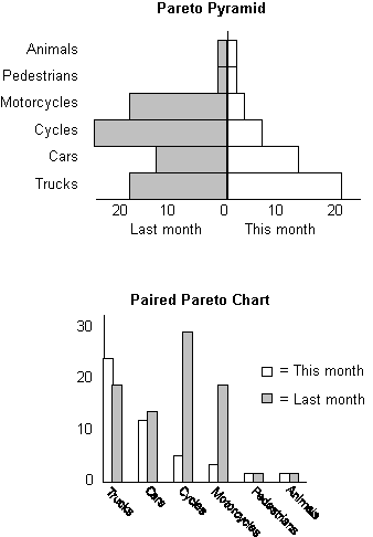
Also, if you have deliberately attacked one bar, you can show how effective your actions have been by taking the same measurements and comparing the before and after Pareto distributions. Two forms of Pareto Chart are shown below by which you can do this comparison.
The Pareto Pyramid puts two charts bottom-to-bottom, with the same measured value at each level. One side has the smooth Pareto curve, whilst the other side is ragged, showing what bars have been pushed out of place. An advantage of drawing bars horizontally is that the labels, which can be quite long, are easier to position and read.
The Paired Pareto shows each pair of before-and-after bars side by side. This is more immediately recognisable as a Pareto Chart.
Note the difference between using the Pareto sorting on 'before' as against 'after' (as in the diagram). There is no one right way, but the subtle emphasis can be different. If in doubt, try both ways and try to understand the impact that both may have, and how you would explain each to someone fresh to the problem.
Next time: Quick decisions with Voting
This article first appeared in Quality World, the journal of the Institute for Quality Assurance |
Site Menu |
|
Quality: | Quality Toolbook | Tools of the Trade | Improvement Encyclopedia | Quality Articles | Being Creative | Being Persuasive | |
|
And: | C Style (Book) | Stories | Articles | Bookstore | My Photos | About | Contact | |
|
Settings: | Computer layout | Mobile layout | Small font | Medium font | Large font | Translate | |
You can buy books here |
|
And the big |