The Psychology of Quality and More
|
|
The Psychology of Quality and More |
Histograms part 2: interpreting themQuality Tools > Tools of the Trade > 65: Histograms part 2: interpreting them
Histograms, as discussed last time, are bar charts that are used to show the frequency distribution of a set of measures. This month we will conclude our short tour with an investigation into different shapes of Histogram that might be found and the interpretation that may be concluded. The most common shape of Histogram that is found
both in nature and in business is the Normal, or Gaussian distribution. The
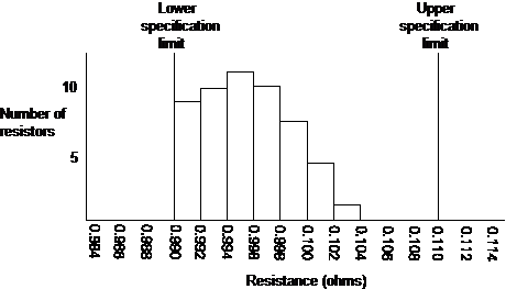
bell-shape of such distributions, as in the diagram below, follows a
mathematically defined curve that enables predictions to be calculated about
probable future measures.
Beyond predictive uses, the Histogram is often used to provide information about potential problems in the process. Note the word ‘potential’ – as with any other measure, the interpretation seldom provides conclusive evidence, but it will often give a strong hint as to where you should investigate next. The table below indicates a number of the different shapes you might find and useful interpretations that can be drawn from them. Table 1. Histogram shapes and interpretations
Thus, for example, if an electronics manufacturer received a number of 0.1 ohm resistors and measured the resistance of sample of them, they might find the following Histogram. This should indicate to them that, although the resistors are within specification, they have been selected from a lot where the average resistance is closer to 0.995 ohms. Although a good electronic design should cope with this variance, the manufacturer may look more closely at other components from the same supplier, and explore other suppliers who might give a more centralized supply of components.
Fig. 2. Example sample of resistors Next time: Scatter diagrams
This article first appeared in Quality World, the journal of the Institute for Quality Assurance |
Site Menu |
|
Quality: | Quality Toolbook | Tools of the Trade | Improvement Encyclopedia | Quality Articles | Being Creative | Being Persuasive | |
|
And: | C Style (Book) | Stories | Articles | Bookstore | My Photos | About | Contact | |
|
Settings: | Computer layout | Mobile layout | Small font | Medium font | Large font | Translate | |
You can buy books here |
|
And the big |