The Psychology of Quality and More
|
|
The Psychology of Quality and More |
Scatter Diagram (part 2: calculations)Quality Tools > Tools of the Trade > Scatter Diagram (part 2: calculations)
In this article, we will look at calculations for three items around Scatter Diagrams: the correlation coefficient, the regression line and the standard error.
The degree of correlation in a Scatter Diagram can be calculated, and which leads to a number known as the correlation coefficient or the coefficient of correlation. This can have a value from -1 through to +1. A correlation coefficient of +1 indicates a perfect positive correlation, with all points in a perfect line going from the bottom left to the top right. A correlation coefficient of -1 indicates a perfect negative correlation, with all points in a perfect line going from top left to bottom right. A coefficient of zero indicates no correlation at all, and points will be randomly scattered across the measurement space.
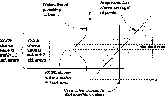
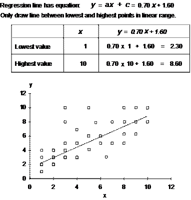
A line of ‘best fit’, or regression line can be drawn through points to indicate the centre locus of the points, as in Figure 1. A way of calculating this is known as the method of ‘least squares’.
The standard error is, effectively the standard deviation in a single slice across the diagram. If there is a Normal distribution across the slice (as there may well be if there is a central tendency), then this can be used to predict probable positions of points.
Fig 1. Variation across the Scatter Diagram
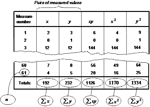
Doing the calculations Calculating these figures may seem daunting, but in fact is quite straightforward. The pictures below show the steps you can take to work out correlation coefficient, standard error and also draw the line of best fit. The first step is to draw up columns containing the pairs of numbers that make up each point on the Scatter Diagram, and add further columns to multiply each pair and square them individually, and then sum each of the columns.
Fig. 2. First stage calculation
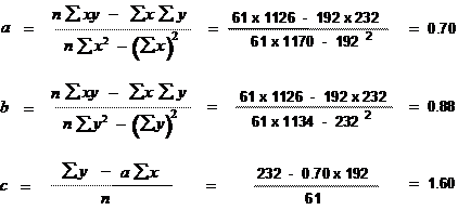
The next step is to do some fairly fiddly calculations for values a, b and c, as in Figure 3 Using a spreadsheet, once you have set up the formula (check carefully that this is correct!), this is again a simple step.
Fig. 3. Second stage calculation
The third stage can now be used to calculate the correlation coefficient, r, and the standard errors, s, as in Figure 4.
Fig. 4. Third stage calculation
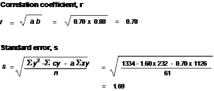
Finally, the regression line points can be calculated, using the values of a and c from the second stage calculations. All that is needed to draw a line is two points, so simply select a low and high value of x and work out the values of y, using the standard formula for a straight line, y=ax + c, as in Figure 5.
Fig. 5. Fourth stage calculation
Next time: Control chart (part 1: interpretation)
This article first appeared in Quality World, the journal of the Chartered Quality Institute
|
Site Menu |
|
Quality: | Quality Toolbook | Tools of the Trade | Improvement Encyclopedia | Quality Articles | Being Creative | Being Persuasive | |
|
And: | C Style (Book) | Stories | Articles | Bookstore | My Photos | About | Contact | |
|
Settings: | Computer layout | Mobile layout | Small font | Medium font | Large font | Translate | |
You can buy books here |
|
And the big |