Bar Chart: Practical variations
The Quality Toolbook >
Bar Chart > Practical variations
When to use it | How to understand it |
Example | How to do it | Practical
variations
<-- Previous |
Next
-->
Practical variations
A number of practical variations on Bar Charts are
shown below.
Table 1. Bar Chart variations
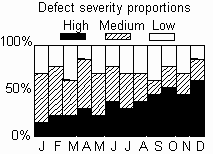
| Percentage Bar Charts are stacked Bar Charts that
have each bar stretched to the same length. This shows the relative
contribution of each piece of each bar.
This can be useful for showing proportionate trends that are hidden by
the variation in the actual total sizes of the bars. |
 |
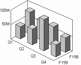
| Three-dimensional Bar Charts are an attractive and clearer
alternative to Side-by-side Bar Charts, although care must be taken to avoid
bars to the rear being obscured by larger bars at the front. |
 |
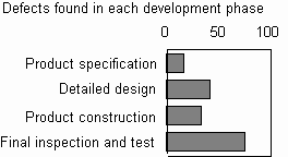
| Show bars horizontally, rather than vertically, allowing bar
labels to be written in the more readable horizontal plane. This is
particularly useful when there are long bar labels. |
 |
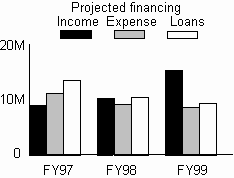
| Side-by-side Bar Charts have multiple bars at each
measurement position, and are typically used to compare two or three related
sets of measurements.
As this reduces the width of bars and increases the complexity of the
chart, it imposes a practical limit on the number of groups that can
usefully be shown. |
 |
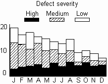
| Stacked Bar Charts have single bars which are split
into several pieces. They are typically used to sub-classify the values at
each measurement position. Note how no space between bars reduces the
independence of each bar and emphasizes continuous change. |
 |
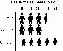
| Pictorial Charts use pictures or symbols instead of
continuous bars. This gives a more dramatic format and emphasizes the number
represented by the bar. |
 |
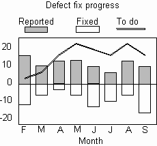
| Use negative and positive bars to show negative and positive
aspects of a measurement set (such as revenue and expenditure). It can
also be useful to superimpose a line graph, showing such as an overall
trend. |
 |
- The Pie Chart is closely related to the Percentage Bar Chart, in
that it highlights the proportionate (rather than absolute) size of a set of
data, using angle rather than length to show relative proportions. Where more
than one Pie Chart are shown together, the diameter can be used to indicate
the total size, as in Fig. 4. Other variations on Pie Charts include 'cutting
out' key segments and using 3-D effects.
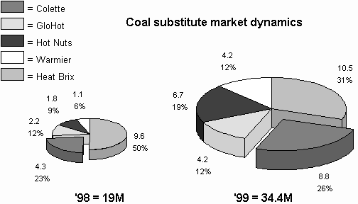
Fig. 1. Pie Chart
- The Band Chart is a cross between the Percentage Bar Chart and the Pie Chart, as it shows a single set of figures as a percentage. It is similarly useful for comparing proportionate differences between two or more sets of figures, as in Fig. .
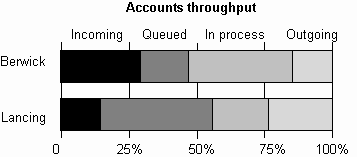
Fig. 2. Band Chart
- A Radar Chart (or Glyph) is a Bar Chart with individual bars arranged in a circle and lines drawn between the top of each 'bar'. This is useful for showing performance relative to limits or other measurement sets, with crossing lines highlighting changes. Radar charts are useful for showing improvements of the same system or for comparing different items, such as in competitive analysis.
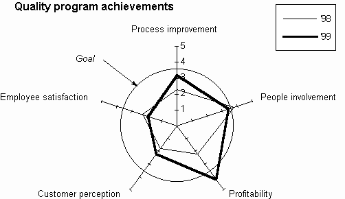
Fig. 3. Radar Chart
- Use a graphic picture to show the presence/absence or size of measured items. The picture may be something relevant to the data being displayed, such as a boat for naval information.
<-- Previous |
Next
-->
|


