The Psychology of Quality and More
|
|
The Psychology of Quality and More |
|
A Toolbook for Quality Improvement and Problem Solving (contents) |
Line Graph: How to understand itThe Quality Toolbook > Line Graph > How to understand it When to use it | How to understand it | Example | How to do it | Practical variations
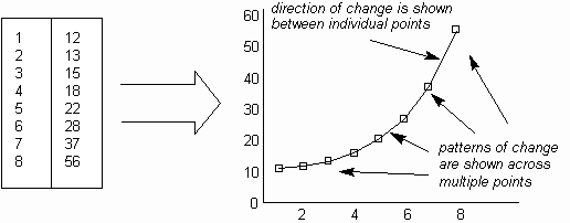
How to understand itWhen taking measurements of a process, the result is often a simple list of numbers. Although this list may be interpreted to some degree by examination, the information contained in the numbers can often be made easier to understand by showing the numbers in a Line Graph. The points on the graph are plotted from pairs of numbers in the list, with lines drawn between each pair, as in The illustration. Typically, one number in the pair is the measured item and is shown on the vertical axis, whilst the second number, shown on the horizontal axis, indicates either the time or sequence number of the measurement. A Line Graph highlights the relative change between individual measurement points through the slope (or gradient) of the line drawn between them, as in The illustration. The change across a number of points can be seen through the overall shape of the graph.
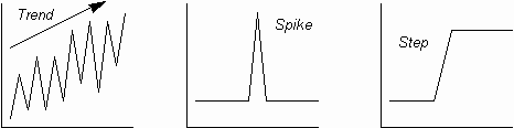
When the graph is drawn, patterns of change may then be identified and interpreted. Fig. 1. shows some typically significant patterns:
Fig. 1. Trends, spikes and steps
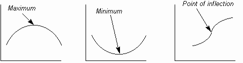
Fig. 2. Curve change points
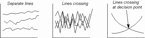
Multiple Line Graphs, can be useful for showing multiple sets of measurements, either to save graph space or to compare measurement sets, but they become unusable where lines get confused through crossing one another. Line crossing is useful where this highlights a decision points. These are illustrated in The illustration.
Fig. 3. Multiple lines
|
Site Menu |
|
Quality: | Quality Toolbook | Tools of the Trade | Improvement Encyclopedia | Quality Articles | Being Creative | Being Persuasive | |
|
And: | C Style (Book) | Stories | Articles | Bookstore | My Photos | About | Contact | |
|
Settings: | Computer layout | Mobile layout | Small font | Medium font | Large font | Translate | |
You can buy books here |
|
And the big |