The Psychology of Quality and More
|
|
The Psychology of Quality and More |
|
A Toolbook for Quality Improvement and Problem Solving (contents) |
Pareto Chart: How to understand itThe Quality Toolbook > Pareto Chart > How to understand it When to use it | How to understand it | Example | How to do it | Practical variations
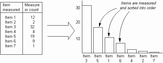
How to understand itGiven a set of recurring problems, it is unlikely that each problem will occur the same number of times in any one period. In fact, it is common that a few problems will occur far more often than the rest put together. This unequal distribution occurs in many situations and can be used to single out the 'vital few' from the 'trivial many'. The Pareto Chart is simply a Bar Chart in which the bars sorted into size order, with the highest bar on the left, as below.
Fig. 1. The Pareto Chart
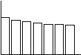
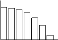
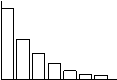
This not only shows the absolute priority of each bar, through its position in the chart, but also its relative priority, through its height as compared with the other bars. As the Pareto Chart is often used for decision making, it is an important parts of building a Pareto Chart to identify the right item to measure and show on the chart, as different measures may well result in the bars be ordered quite differently. In a stable process, the order of the bars may be expected to remain constant. Thus, if the order of the bars changes with successive measurements, this may indicate an unstable process (or an insufficient number of measurements). Improvements (i.e. changes in the process) will often result in the order of the bars changing. If the improvements are maintained, the new bar order will remain stable. Pareto Charts may have different overall 'shapes' as shown in the table below. The 'spiky' Pareto Chart is the most useful, as it enables an easy selection of items to carry forwards for further action.
Table 1. Pareto Chart shapes
|
Site Menu |
|
Quality: | Quality Toolbook | Tools of the Trade | Improvement Encyclopedia | Quality Articles | Being Creative | Being Persuasive | |
|
And: | C Style (Book) | Stories | Articles | Bookstore | My Photos | About | Contact | |
|
Settings: | Computer layout | Mobile layout | Small font | Medium font | Large font | Translate | |
You can buy books here |
|
And the big |