syque.com

The Psychology of Quality and More

| Menu | Books | Share | Search | Settings |

Control Chart (part 3: producing the chart)

Quality Tools > Tools of the Trade > Control Chart (part 3: producing the chart)


Over the past two articles in the description of Control Charts we have discussed how to interpret them and the different types of chart you can use. This month, we look at the overall process for producing the chart. Calculations for these are quite involved and hence will be covered in future articles.

  1. Identify the purpose of using the Control Chart. Typically this will be either to detect defects or to monitor a suspect or critical process. 

  2. Identify what you will need to measure and where in the process the measure should be made. Select measures on a combination on ease of measurement and and (of course) the chance that they will show problems that meets your purpose. Focus the measurement to minimise likely variation and maximise detection of specific issues, for examply by using a separate control chart for each of separate production lines being assessed.

  3. Identify the type of Control Charts to use. This was discussed last time, in part 2 of this series. Briefly, for variables, you can choose X/MR, X-bar/R or X-bar/S charts, whilst for attributes, you can choose between u, c, p and np, depending on whether you are measuring defects or defectives, and whether subgroups contain the same number of measures. 

  4. Choose the subgroup. This is the group of measurements that will make up each plotted point on the Control Chart. Each subgroup typically contains the same number of measurements, although p- and c-charts are bounded by events, such as time (e.g. measurements per week), people or batches. Use the table below to decide how many measures you need in each subgroup.


Type of chart

Number of measurements taken for each subgroup

Individuals and Moving range
(X, MR charts)

1 or 2

Average and Range
(X-bar, R charts)

2 to 10 (typically 4 or 5)

Standard deviation
(s chart)

Typically 10 or more
(may be less)

Proportion defective
(p chart)

50 or more (individual subgroups may vary).
May be less if there are 4 or more defects per unit.

Number defective
(np chart)

50 or more.
May be less if there are 4 or more defects per unit.

Defects per unit
(u chart)

50 or more (individual subgroups may vary)

Defects per subgroup
(c chart)

50 or more


The subgroup should be selected with the aim of making the measurement within each subgroup as consistent as possible, whilst maximizing the chance of highlighting differences between subgroups. Further considerations for subgroups include:

·            Synchronizing measurement points with other process variables, for example, measuring weekly rather than every four days.

·            Using experience to determine subgroups, for example, known tool wear rates.

·            Using larger subgroups, as they result in Control Charts which are more sensitive to change.

·            Using smaller subgroups when they are expensive or time-consuming.

·            Measuring more frequently when significant variation can occur over a short period.

·            Initially measuring more, then reducing measurements as the data is understood.

·            Using consecutive measurements, rather than a random sample, as this will result in less variation within the subgroup, with tighter, more sensitive control limits.

·            Selecting subgroup measurement which seldom results in zero value points. For example, counting customer complaints per hour when there are only one or two per day, will give many points plotted on the zero line.


  1. Prepare for measurement, including ensuring measurements will be made correctly and that people understand what is happening.

  2.  Make the measurements as planned in step 5.

  3. Calculate mean and upper and lower control limits. This is quite an involved process and will be covered in later articles. 

  4. Draw the charts, including one plotted point for each subgroup, with a line drawn between successive points, horizontal lines for each of the central line and control limits, plus labelling and other information to help in interpretation. Note that although most control limits are straight lines, the p- and u- charts may have control limits that are different for each plotted point, as Fig. 1.


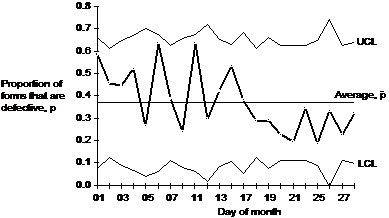
Fig 1. Example p-chart


  1. Interpret the charts, looking for significant patterns and points, and act on the results. Typically this will involve finding for the cause of any identified significant set of points, followed by devising a method of correcting the problem.


Next time: Calculation detail for X-MR and X-bar/R charts.


This article first appeared in Quality World, the journal of the Chartered Quality Institute


Site Menu

| Home | Top | Settings |

Quality: | Quality Toolbook | Tools of the Trade | Improvement Encyclopedia | Quality Articles | Being Creative | Being Persuasive |

And: | C Style (Book) | Stories | Articles | Bookstore | My Photos | About | Contact |

Settings: | Computer layout | Mobile layout | Small font | Medium font | Large font | Translate |


You can buy books here

More Kindle books:

And the big
paperback book


Look inside


Please help and share:


| Home | Top | Menu |

© Changing Works 2002-
Massive Content -- Maximum Speed