The Psychology of Quality and More
|
|
The Psychology of Quality and More |
|
A Toolbook for Quality Improvement and Problem Solving (contents) |
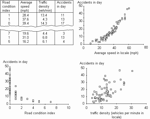
Scatter Diagram: ExamplesThe Quality Toolbook > Scatter Diagram > Examples When to use it | How to understand it | Example | How to use it | Practical variations
ExampleA town planning team, during an investigation of road accidents, identified a number of possible causes. Three main causes were suspected: the speed of the vehicles, the traffic density and the local weather conditions. As there was no clear evidence available to support any of these hypotheses, they decided to measure them, and used Scatter Diagrams to check whether the link between any of the causes was strong enough to take further action. In order to get sufficient measures, they made daily measures for two months, using local road sensors and reports from the ambulance service. Scatter Diagrams were drawn for each possible cause against the accident count. The results enabled the following conclusion to be made:
As a consequence, more traffic speed control measures were installed, including signs and surfaces. This resulted in a measurable decrease in accidents.
Fig. 1. Example Scatter Diagrams
|
Site Menu |
|
Quality: | Quality Toolbook | Tools of the Trade | Improvement Encyclopedia | Quality Articles | Being Creative | Being Persuasive | |
|
And: | C Style (Book) | Stories | Articles | Bookstore | My Photos | About | Contact | |
|
Settings: | Computer layout | Mobile layout | Small font | Medium font | Large font | Translate | |
You can buy books here |
|
And the big |