The Psychology of Quality and More
|
|
The Psychology of Quality and More |
|
A Toolbook for Quality Improvement and Problem Solving (contents) |
Scatter Diagram: How to understand itThe Quality Toolbook > Scatter Diagram > How to understand it When to use it | How to understand it | Example | How to do it | Practical variations
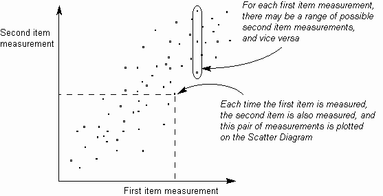
How to understand itWhen investigating problems, typically when searching for their causes, it may be suspected that two items are related in some way. For example, it may be suspected that the number of accidents at work is related to the amount of overtime that people are working. The Scatter Diagram helps to identify the existence of a measurable relationship between two such items by measuring them in pairs and plotting them on a graph, as below. This visually shows the correlation between the two sets of measurements.
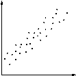
Fig. 1. Points on Scatter Diagram
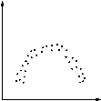
If the points plotted on the Scatter Diagram are randomly scattered, with no discernible pattern, then this indicates that the two sets of measurements have no correlation and cannot be said to be related in any way. If, however, the points form a pattern of some kind, then this shows the type of relationship between the two measurement sets. A Scatter Diagram shows correlation between two items for three reasons:
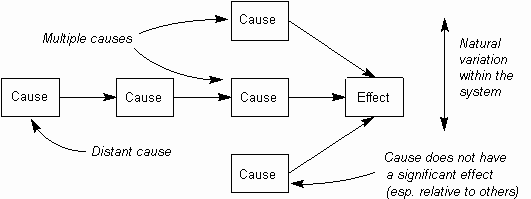
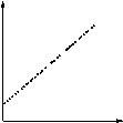
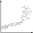
Scatter Diagrams may thus be used to give evidence for a cause and effect relationship, but they alone do not prove it. Usually, it also requires a good understanding of the system being measured, and may required additional experiments. 'Cause' and 'effect' are thus quoted in this chapter to indicate that although they may be suspected of having this relationship, it is not certain. When evaluating a Scatter Diagram, both the degree and type of correlation should be considered. The visible differences in Scatter Diagrams for these are shown in Tables below. Where there is a cause-effect relationship, the degree of scatter in the diagram may be affected by several factors (as illustrated in the diagram below):
Fig. 2. Complex causes
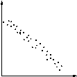
There is no one clear degree of correlation above which a clear relationship can be said to exist. Instead, as the degree of correlation increases, the probability of that relationship also increases. If there is sufficient correlation, then the shape of the Scatter Diagram will indicate the type of correlation (see Table @@). The most common shape is a straight line, either sloping up (positive correlation) or sloping down (negative correlation).
Table 1. Degrees of Correlation
Table 2. Types of Correlation
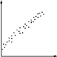
Points which appear well outside a visible trend region may be due to special causes of variation, and should be investigated as such. In addition to visual interpretation, several calculations may be made around Scatter Diagrams. The calculations covered here are for linear correlation; curves require a level of mathematics that is beyond the scope of this book.
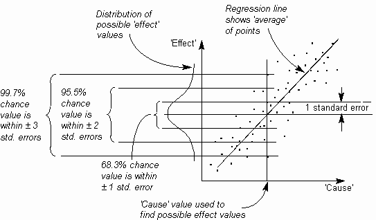
Calculated figures are useful for putting a numerical value on improvements, with 'before' and 'after' values. They may also be used to estimate the range of likely 'effect' values from given 'cause' values (assuming a causal relationship is proven). The figure below shows how the regression line and the standard error can be used to estimate possible 'effect' values from a given single 'cause' value.
Fig. 3. Distribution of points across Scatter Diagram
|
Site Menu |
|
Quality: | Quality Toolbook | Tools of the Trade | Improvement Encyclopedia | Quality Articles | Being Creative | Being Persuasive | |
|
And: | C Style (Book) | Stories | Articles | Bookstore | My Photos | About | Contact | |
|
Settings: | Computer layout | Mobile layout | Small font | Medium font | Large font | Translate | |
You can buy books here |
|
And the big |